Finally we started the final project. After some comings and goings, BeKind was settled as our client for this project. BeKind is (in 2023) a very early stage organization that wants to develop a digital online marketplace to connect companies and individuals who want to donate all kinds of items with NGOs and Charities that would give those items a second life. This platform is intends to contibute to the circular economy, to reducing waste and saving the environment.
We started by conducting a kick-off meeting with BeKind to get to know each other and know a little bit more
about their project and the challenge they were presenting us to be solved.
It seems that BeKind is at a very early stage of their development, as they are currently searching for investors,
but they lacked any visual idea of how their donations platform would be or look, although they had a very thorough
market analysis and a list of possible organisations that could benefit from their platform a lot. They provided
us with this valuable information and others that would smooth the start of this project.
After this first meeting we started contacting Charities and NGOs to set meetings and interview them as potential
users for this app, from the perspective of the beneficiary of these donations as a user flow. In the meantime
when we waited for answers, we conducted some interviews with individual donors, people that are used to donating
items or are willing to do it, and some interesting insights came. It seems that although people are willing to
donate items the majority of them are not willing to pay for the transport of these items to the Charity
(specially required if the item you donate is big and you need to wire a moving company or rent a van for
example to do the trick).
Finally we managed to schedule some Charities/NGOs interviews with some members of those, and again very helpful
insights came up, but this time from the other side of the donation process. The main topic here was that although
is very helpful that people donate their items that don’t need anymore, they should conduct an initial filtering
thinking for each item if it is in a sufficient good condition to be used for others, so the donating process does
not become just another way to get rid of the things you do not want anymore.
We wanted to interview the last party in this process, that would be the donor companies, which tend to have a
slightly different donation process than the individual donors. We tried contacting them, but with the time we
had it was very difficult to schedule interviews. We managed to interview a former worker of a very big company
that is used to donating items and money to charities, but of course despite it being valuable information, it was
not primary information. We managed to contact the CEO of a British company that produces kitchens tools and
donates items that have little defects, enough to not be able to be sold, but still being ambe to be used.
It was a very short interview though, and we couldn’t get all the information we wanted from there to have all
the pictures for the company's donation process.
After realizing that we did not have all the information we wanted for the Companies Userflow, we decided to focus
just on the Individual donors and Charities/NGOs User Flows for this project.
Paralelly to all the Interviews, we got to conduct some Secondary Research. For this, we focused on donations of material
items, not money and on Charities that sell second-hand items. We discovered that just a quarter of the items sent to
Charities shops is sold locally. The rest in the end has to be resold abroad, recicled or reprocessed into other things.
Additionally, to better understand how the other similar platforms worked, we analyzed them.
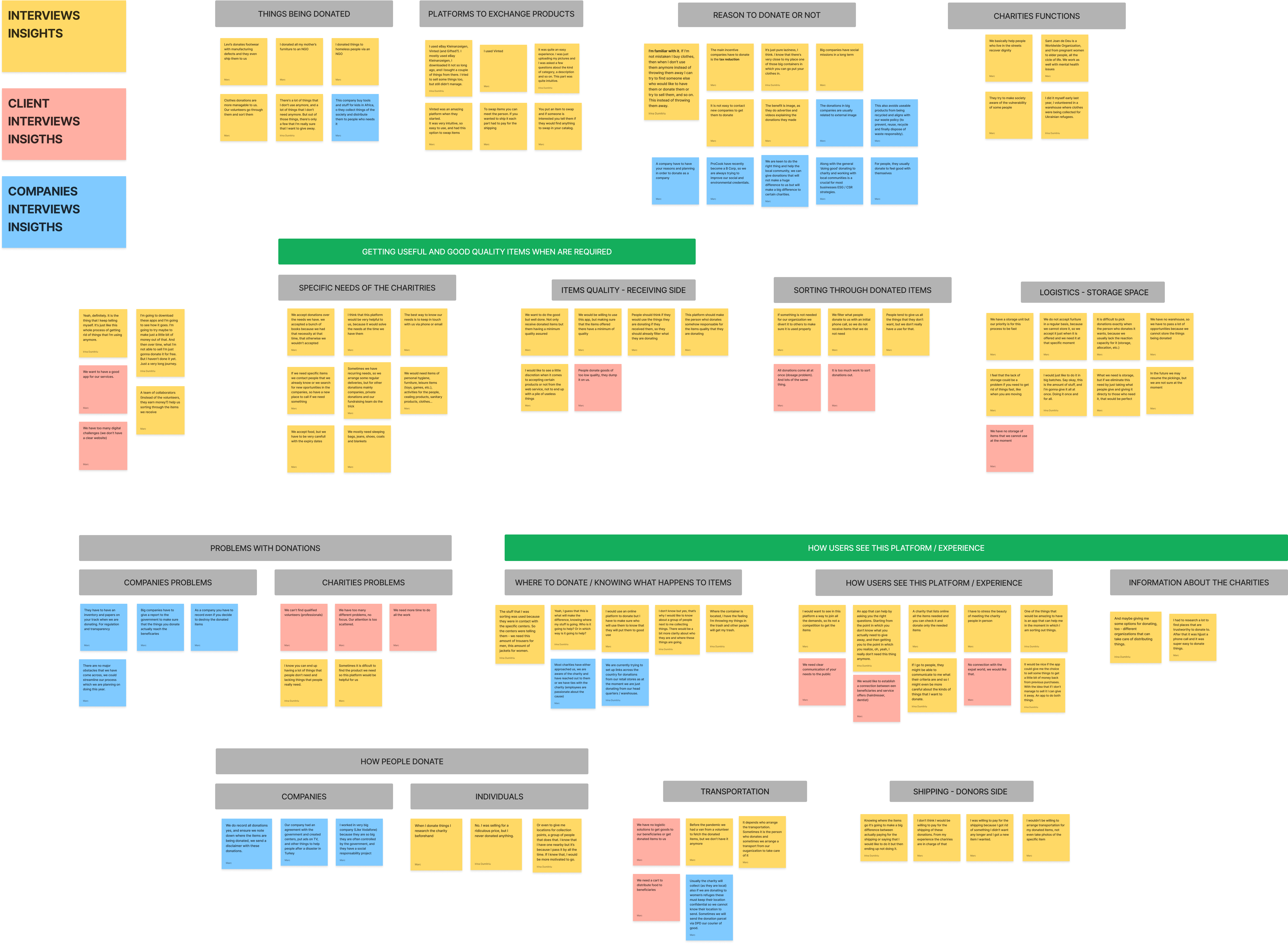
First things first, we grouped all the insights we got from pur interviews in an Affinity Diagram, so we could clearly see the main topics and groups we had to start working.

In the Affinity Diagram we added the insights from the Client and the few insights we could get from the Companies that donate items usually.
Next step was to define the Empathy Maps with all the information we got. In this project we needed two of them, one for the Individual Donors and the other for the Charities/NGOs.
Summarizing, we were able to identify the following pain points in which we could start working on:
Donors
Next step was to define our User Personas, as we dah allready all the information needed for that. We created two User Personas, one for a Charity Worker, another for an Individual Donor, and finally we created a Lean User Persona for a Company Worker with the little information we gathered on the matter and some assumptions we got from the other parties involved.
Following up, we built the User Journey Maps for Toni and Maria. For that we first tried to identify the journeys each of them got, either trying to get the items they need or donate the items they don’t need anymore. After that we identified the painpoints in each journey and consequently the opportunities that they offered us.
Finally, with the Empathy Maps, User Personas and Journey Maps clearly defined, the last thing to do in the Define
step was to state our Problem Statements for Individual Donors and for Charities/NGOs.
Charities/NGOs Problem Statement
“Charities and NGO’s need to find a way to get good quality items when they need them because locating, sorting and storing items is difficult, expensive and time-consuming.”
Individual Donors Problem Statement
“People who have material items to give away need to find a way to donate them in a quick and easy way because finding a charity is complicated and selling the items is a more straight forward process.”
In this step we started brainstorming and creating possible solutions for our users problems. To be honest, on the Define part of the process we already had some ideas, and even a clear sketch of how this platform should be. But nonetheless, we created some Crazy 8s to see if more ideas and possible features could come up.
After that, we created a MOSCOW Map. There we added the requirements from our Client, the ideas that came up from the Crazy 8s, and all the things we thought of during the process. The platform we were going to design was beginning to take shape.
Later, we worked on our Minimum Viable Product, making it clear what the minimum qualities and features would be for our product to work. It is below.
“Be Kind is a web platform that connects individuals and companies who want to donate and charities and NGO’s, with specific registration processes, allowing users to filter, locate and claim the items being donated, set up alerts or wishlists, and notificating the donors when the item has been chosen.”
And as mentioned above, two different Userflows were required for this project, as at least we needed two different paths, one for Donors uploading items and another for Charities/NGOs claiming them.
With all the ideas plainly in our minds, the next step finally was to start prototyping. For it, we both created a Low-fi prototype. We put them in common, explained it and used the best parts of each to create a final Low-fi prototype, ready to be tested.
For it we conducted some Concept Testing. A lot of useful insights came up from that, below are some of them.
Some of the insights we got that we implemented in our Mid-Fi were for instance the reception of positive feedback
once you have uploaded a new item or when you accept the claim of a Charity/NGO. We received as well some insights
to improve the usability of the website, relocating elements or making them more obvious to the user.
For our Mid-fi Prototype, we used all the insights we got from Concept Testing. We refined it and relocated
some elements in the screens.
Now it was time for Usability Testing. In this stage we iterated a lot. It was the stage where the prototype evolved
more, using valuable insights that we got in our tests. Some of the users found missing some features that considered
mandatory in a platform like this. For example the ability to rate or report users, to ensure a minimum of quality
in its functioning, as well as to regulate the possible abuses that could occur during the exchange of items.
Another key feature that we forgot about is the ability to check the Charity/NGO that claimed your item before accept
the exchange, to ensure that their values agree with those of the donor.
The next step was to start thinking of our Hi-Fi Prototype, and to build a Style for it. The first thing we did fot it was to think about our Brand Attributes and to build a Moodboard that expressed them.
We tested the moodboard, and the testees gave almost the exact attributes that we got, so we started thinking of
our Style Tile.
We wanted a clear yet modern Typography for our platform, so we agreed to use the Satoshi Font Family.
Choosing the colors was not so easy. Initially after several attempts we agreed to use the Navy Blue
we used at the end and a Grass Green. We had a meeting with the client to approve these colors, and
they told us that they did not exactly reflect what they envisioned for their platform, so we had to change them. At the end we added
Turquoise and Yellow to Navy Blue, thus creating
the colors of the brand.
At this point, we could begin to apply our style to the Mid-fi. This was a slow and tedious process, in which even after some additional usability tests we made some changes in usability issues, since we realized that some elements did not have a clear hierarchy that affected the user flow. After a lot of changes and improvements we came up with our Hi-Fi prototype.
We conducted some Desirability Testing at this point, and below you can find some of the attributes we got.
Below you can find and try the final Hi-Fi.
In this project I learned a lot. It was the first project to work from the beginning to the end with a client,
and with various touch points and approvals during the process. This in the end proved to be encouraging but
challenging as well.
Additionally, this was the first project I worked in which several user personas and user flows were involved,
so it was more demanding. Advancing through the project we had to have in mind at all times that everything we
settled affected at least two types of users, so it was more difficult to advance, but more rewarding to see that
everything fell into place in the end.
This has been our last Ironhack project, but also, in my opinion, the most fruitful and the one I'm most proud of.
We have been able to deal with a client who, although he was kind and understanding throughout the project, also
had very clear ideas about the direction he wanted the project to take. It is satisfying though, to see that in
the end, after the difficulties and the short delivery time, all the pieces fit and that the result is satisfactory
and even beautiful.
I have to thank my teammate Irina, who proved to be a very good project partner, useful and understanding. I think
we worked perfectly together.
I hope you enjoyed reading this case study and in any case, thank you for reading it.